
The importance of Data Visualization
Aggregate data to get different information
Reading Time: 6 minutes
Post published on 28/01/2021 by Donata Petrelli and released with licenza CC BY-NC-ND 3.0 IT (Creative Common – Attribuzione – Non commerciale – Non opere derivate 3.0 Italia)
Title Image credits by Campaign Creators on Unsplash
What can I infer from a grid of values?
How many times in front of data table we remain perplexed because we do not know how to use that mixture in information. Or we think that only from big data we can get advantageous information for us or for our business.
In reality, this is not the case… All we need to do is visualize data in a way that is strategic for our objectives and it will “magically” present itself in a form that is useful and decisive for making important decisions.
We can benefit from even a small amount of data. It is not necessary to have a state-of-the-art IT infrastructure or Data Bases worthy of a DBMS. A simple table is enough to draw information that is strategic for our business decisions, decreeing the success of marketing and commercial operations.
In this article we see how it is possible. If you are curious, I invite you to continue …
Data Modeling
We have already seen in a previous article “Data Analysis with Excel” how even from a single column we can obtain important information thanks to the indices of univariate statistics. Just think how much information we can get from a table with multiple columns!
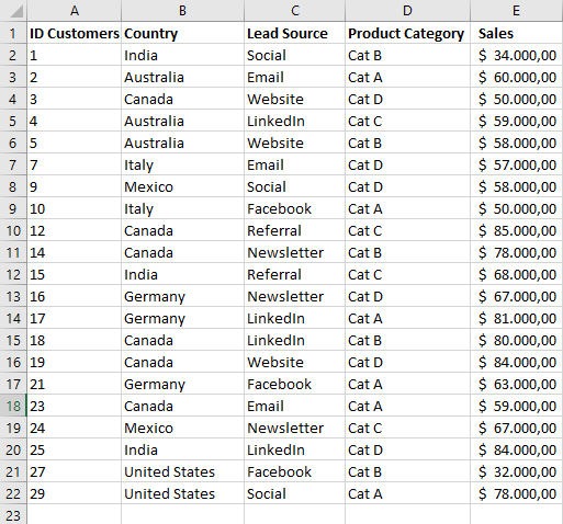
In this regard, let’s start with a situation similar to the one described in the article. The table in Figure 1 shows what is commonly obtained from a CRM.
At first look it may seem like an incomprehensible grid. In reality it is able to tell us a lot. Everything goes through the “data modeling” or the selection, customization and modification of the fields in the original DB so that they show values in a different way, to support our objectives.
For those who want to deepen the topic of data base I invite him to read the article CSV data format, Occam’s Razor in Database
In general and in the context of marketing analytics, fields can be classified into two types: dimensions and metrics.
Dimensions describe the data and are used to group and categorize it. In our table in Figure 1 they are for example Country, Lead Source, Product Category. If we use these fields to group information we can get different views that provide specific information for different purposes.
Any type of data can be a dimension, even a column of non-aggregate numbers. Of course we will choose the most appropriate dimension to get the information useful for our purposes.
For example, if we want to analyze the marketing channels we normally use to decide how to invest our budget in advertising campaigns, we will adopt the “Lead Source” dimension.
Metrics, on the other hand, measure dimensions.
A metric is the result of an aggregation function to a set of values. This aggregation could come from the underlying dataset or be the result of implicitly or explicitly applying an aggregation function.
But what is an aggregate function?
Aggregate function
In order to get specific information from the source data, it is necessary to display it in a way that presents its aggregated values. Aggregation is the method used to summarize the data, or rather a metric, into a value with a more relevant meaning.
According to Wikipedia, “In database management, an aggregate function or aggregation function is a function where the values of multiple rows are grouped together to form a single summary value.”
Common aggregate functions include:
Average: returns the arithmetic mean of the numbers
Count: returns the number of unique values in a measure or dimension
Maximum: returns the largest number in a measure or continuous dimension
Median: is the value separating the higher half from the lower half of a data sample, a population, or a probability distribution
Minimum: returns the smallest number in a measure or continuous dimension
Mode: is value that appears most often in a set of data values
Range: in a set of data is the difference between the largest and smallest values
Sum: is the addition of a sequence of any kind of numbers
Stddev: is a measure of the amount of variation or dispersion of a set of values
Stddevp: Returns the standard deviation of all values of the given expression based on a population
Case study
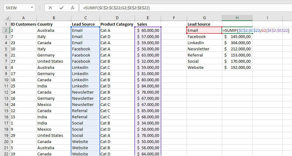
Returning to our example, if we wanted to derive useful information for the next marketing campaign we need to aggregate the data in Table 1 according to the “Lead Source” dimension.
Then we sort the records based on the Lead Source field and analyze the sales associated with each of the channels (Email, Facebook, LinkedIn, Newsletter, Referral, Social, Website) thanks to SUMIF function that sums the values in a range that meet criteria that you specify, as shown in Figure 2:
Syntax is:
SUMIF(range, criteria, [sum_range])
where:
range: is the range of cells that you want evaluated by criteria. (Required)
criteria: is a number, expression, a cell reference, text, or a function that defines which cells will be added. (Required)
sum_range: are the actual cells to add, if you want to add cells other than those specified in the range argument. (Optional)
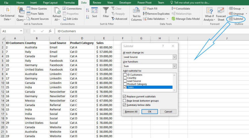
Alternative method
The same procedure can be done through the use of the Excel tool ‘Subtotal’ from the Data menu, Outline group as shown below:
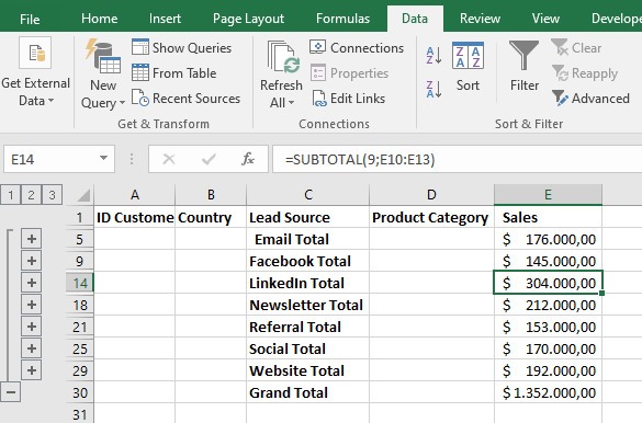
Confirming the settings results in the aggregated data as shown in Figure 4:
Final Analysis
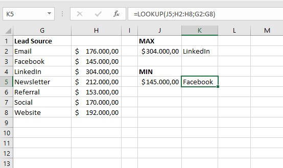
From the aggregated data it is therefore possible to make our conclusive analysis to reveal which is the channel from which our major customers come from and which is the minor one and therefore decide where to invest our budget for the next marketing campaigns or our resources in terms of time or people.
Using the aggregation functions MAX and MIN, not on the original data set but from the result of the first aggregation (Figure 2), we obtain that the highest sales come from clients contacted via Linkedin and the lowest from those contacted via Facebook.
For the use of the MAX and MIN functions you can read the article “Data analysis with Excel”.
It is also used the LOOKUP function, one of the lookup and reference functions, when you need to look in a single row or column and find a value from the same position in a second row or column.
Syntax is:
LOOKUP(lookup_value, array)
where:
lookup_value: is a value that LOOKUP searches for in an array. The lookup_value argument can be a number, text, a logical value, or a name or reference that refers to a value. (Required).
array: is a range of cells that contains text, numbers, or logical values that you want to compare with lookup_value. (Required)
Data Visualization
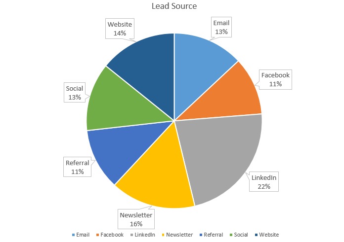
For visualization of the information obtained from the aggregation of the “Lead Source” dimension, we report the table in Figure 5 (bis) in a Pie Chart as shown in Figure 6
Conclusion
We have seen how important it is to have data on which we can work to extract relevant information for our business through a practical example.
In the market there are many software for data analysis, from free to paid, from simple to more sophisticated. In this case we started with a simple flat data base and used Excel and its basic tools to get valuable insights.
This is just to make you understand the importance of data, whatever the type and size and regardless of the analysis tool. You can’t make decisions if you don’t do analysis on hard data. That’s why it’s important for everyone to start with what they have available to them.
How do you do your analysis?