Zoom your data!
The concept of fractals applied to graphical data analysis
Published by Donata Petrelli on 08/06/2021
Image credits by John Finkelstein on Unsplash
Reading Time: 3 minutes
How does one classify the coastlines of seas or the boundaries of states in nature? To describe the architecture that governs the nature of plants and animals? Thanks to fractal geometry!
When we have a lot of data, how do we understand their distribution? To classify their structure? To capture their trend? There are so many methods, from time series analysis to the most advanced data mining applications, many might answer… yes, perfect!
But what if we wanted to do a first visual analysis and immediately get an idea of its nature?
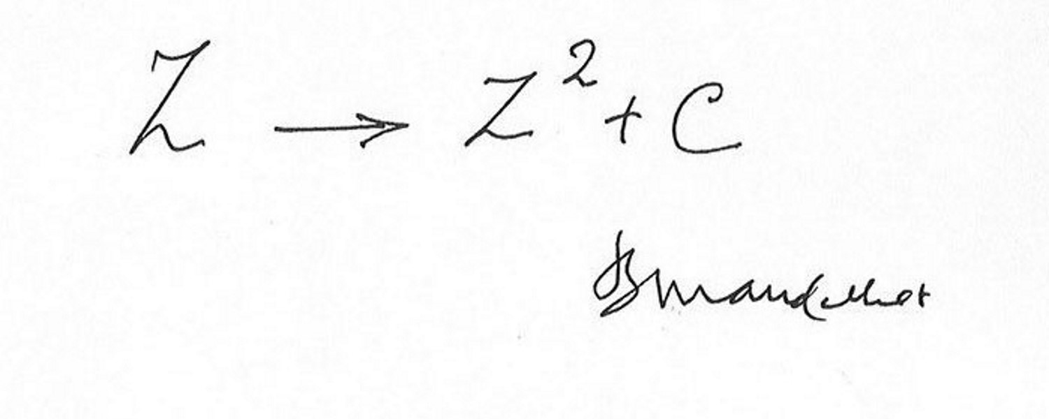
Let’s try to reason like in nature and apply the concept of fractals, whereby a figure is similar to one of its parts, i.e. has the same shape as this one, to the chart of data distribution.
Let’s discover the magic of fractals through a practical example.
Suppose we want to analyze Euro British Pound Exchange Rate (EUR GBP). We retrieve data from the last year or so (May 2020 – Jun 2021), put it into an Excel spreadsheet, and plot the closing price chart to see the trend at a glance.
The result is shown in Figure 1.
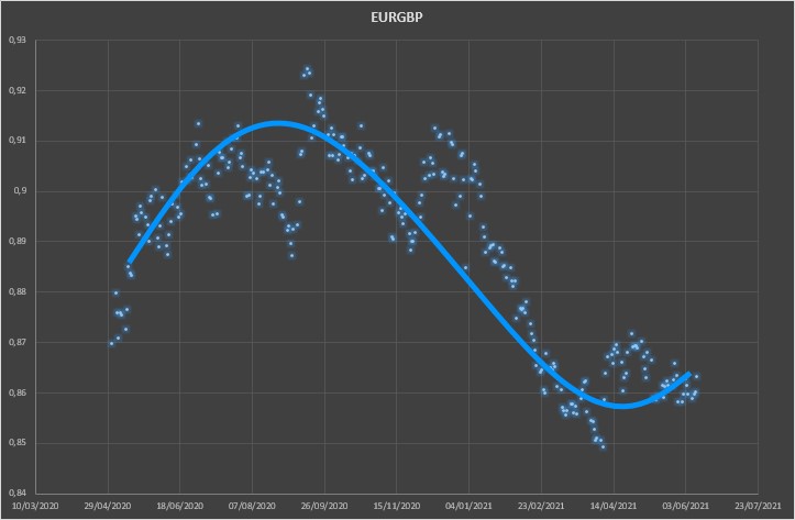
What can we say about this stock at a first chart analysis? It’s a periodic trend, where after a first phase of decrease we see a growth in the second part of the chart.
But we can go further. We can analyze the chart even better and see if it is a figure composed of individual periodic figures.
We apply the ZOOM to the Data!
That is, we analyse part of the whole image and only analyse the values from November 2020 to June 2021 as in Figure 2.
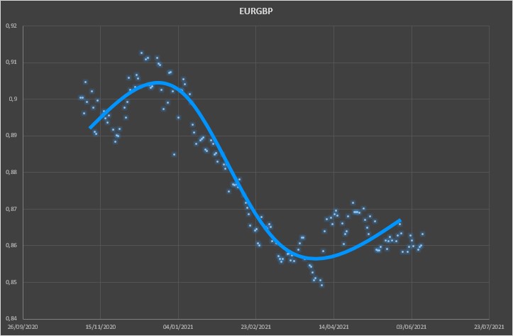
Also here we can notice how a decreasing phase is followed by a growing one in the last part. But we can still zoom the image and understand if, once again it is a fractal figure, or the result of a repetition of similar images.
Let’s zoom in on the latest data and analyse just the period April 2021 – June 2021 as shown in Figure 3.
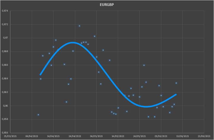
Again we note that there is a sinusoidal structure underlying the chart structure.
This short article aims to provide a different approach to the study and analysis of data. With this example we have shown how fractal geometry is not only used to describe nature and its phenomena, but also those of financial markets, to find all those analogies and repetitions of patterns that reveal intrinsic characteristics of an asset and therefore serve to continue with methods aimed at in-depth trend analysis.
If you found this article useful and want to know about new articles, I invite you to sign up for my blog’s free newsletter.
Published with licenza CC BY-NC-ND 3.0 IT (Creative Common – Attribuzione – Non commerciale – Non opere derivate 3.0 Italia)