
Statistics with Excel, the Correlation
Learn a powerful Statistics tool with Microsoft Excel
Reading Time: 6 minutes
Post published on 22/03/2020 by Donata Petrelli and released with licenza CC BY-NC-ND 3.0 IT (Creative Common – Attribuzione – Non commerciale – Non opere derivate 3.0 Italia)
Knowing whether a particular agent can influence the diffusion of a virus or a macro-political event can affect the trend of a financial asset, are problems that a priori can not have immediate and predictable response but whose solution makes difference for the common interest.
In general, the analysis of data that describe a phenomenon and their realistic interpretation are the basis of scientific research that has as its goal the understanding of the phenomenon itself and its most likely future development. The scientific approach generally tends to find what and how many may be the causes that lead to the manifestation of the event. However, the cause-effect relationship is not always evident and, therefore, it is not so immediate to find an optimal solution to a contingent problem.
This article talks about a mathematical method to identify whether between two quantities, of which any kind of association is a priori ignored, there can be a relationship such that the variation of one involves the variation of the other and, if so, by what measure. That is the correlation. We will use a powerful and simple tool as Excel.
The correlation … what’s it for
It often happens that describing the behavior of a variable, perhaps dependent on others, is not sufficient for the analysis of a much more complex phenomenon, in which there are other parameters whose mutual relationship with the studied variable is not yet known.
In this case we have to verify if there is a relationship between the characteristics of the phenomenon (the variables) and, if it is so, of what intensity. It is necessary to study the correlation between the variables.
In the correlation analysis, the variables are indicated with X1 and X2 and not X and Y, as in the case of cause-effect relation that we all know, just to highlight the absence of the concept of functional dependence.
We don’t yet know if and what kind of relationship exists between them. We use the correlation to assess if there is a linear relationship between them.
If the analysis is negative, i.e. there is no linear relationship, this doesn’t mean that there can be no other relationship. For example, there could be a polynomial relationship of a degree > 1. We should therefore use other, more sophisticated techniques to verify this.
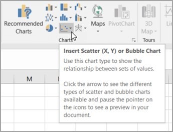
Chart Analysis with Excel
In general the chart is the first and most important analysis tool that allows us to make the first considerations about the trend of a phenomenon. Also in this case the first thing to do is to analyze the chart of distributions of the values of the two quantities and thus visually verify if there can be a relation between the two variables.
We normally use the Scatter Chart or Bubble Chart present in the Excel charts collection.
After obtaining the data of the two quantities, using the appropriate data mining techniques and after verifying the number of values to be represented, creating a scatter chart is very simple:
-
Select the data you want to plot in the scatter chart
-
Click the Insert tab, and then click Insert Scatter (X, Y) or Bubble Chart
-
Click Scatter
Let’s take an example. We want to compare the pairs of price values of two different stocks to determine whether there is a correlation between the two stocks. For educational purposes only, we try to compare the closing prices of Intel and AMD. We create a first scatter by putting the Intel values on the X-axis and the AMD values on the Y-axis. Then a second one doing the opposite, i.e. putting the AMD values on the X-axis and the Intel values on the Y-axis.
In both cases we add a trendline to scatter chart and display R^2 value, that measures the soundness of the linear model obtained, and Equation.
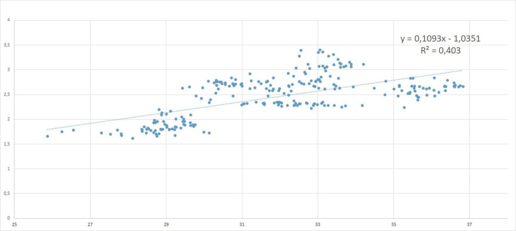
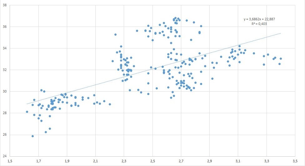
What we get seems impressive. Although the equations are different, the value of R^2 is the same in both cases. This means that the correlation makes no distinction on which quantity is reported in the horizontal axis and which in the vertical one. The correlation studies the relationship between the quantities in an absolute sense, which is in the absence of an a priori hypothesis of a certain functional dependence between the represented variables.
Generally its use is appropriate when the scatter has an oval shape as in the examples shown in the two previous figures.
Correlation coefficient
The explanation for the above fact lies in the very nature of the correlation as the measure of the intensity of the associations and not the dependency of the relationship. That is, it is said that between the two variables there is a correlation when the tendency of a variable to vary with a more or less high level of intensity as a function of another one occurs, but no diagnosis of the type of relationship is made.
Sometimes the variations of one variable derive from those of the other (e.g. the relation between heritable somatic characters), others are common (relation between stature and individual weight), sometimes mutually dependent (relation between price and demand: the price influences to modify the demand, the demand influences to modify the price).
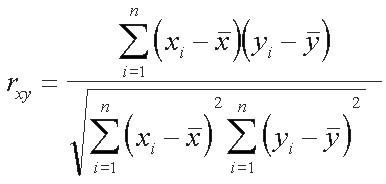
The correlation coefficient measures the intensity of these relationships. There are different types, corresponding to different calculation methods and, therefore, there are different formulas for this. We consider the Pearson correlation coefficient with the following formula:
The following can be deduced from the analysis of the formula:
- rxy > 0 means that X and Y are directly correlated
- rxy = 0 means that X and Y are not correlated
- rxy < 0 means that X and Y are inversely correlated
The absolute value (|0,X|) indicates the degree of interdependence:
- rxy < 0.3 weak correlation
- rxy >= 0.3 And rxy<= 0.7 moderate correlation
- rxy > 0.7 strong correlation
Correlation with Excel
From Pearson’s formula it can be seen that the correlation is based on the concept of covariance between two variables. Therefore you can manually construct this coefficient step-by-step using the Excel Statistical Functions:
STDEV.P(number1,[number2],…)
where:
Number1: (Required) The first number argument corresponding to a population.
Number2 … : (Optional) Number arguments 2 to 254 corresponding to a population. You can also use a single array or a reference to an array instead of arguments separated by commas.
and
COVARIANCE.P(array1,array2)
where:
Array1: (Required) The first cell range
Array2: (Required) The second cell range
Otherwise you can directly use the CORREL function with the following syntax:
CORREL(array1, array2)
where
Array1: (Required) A range of cell values
Array2 : (Required) A second range of cell values
Conclusion
In any field of application, medical, economic, financial, political, etc., correlation analysis is the first step in the analysis of dependence between variables. In this short article, we have seen how to do it via Excel, a powerful and, at the same time, popular tool.
From here we can then deepen the relationship through more specific analysis methodologies, such as, for example, regression (simple, linear, multiple). These are tools of mathematics and statistics and require the user’s knowledge of their meaning.
Today we also have innovative Artificial Intelligence techniques that allow us to delegate to the machine the duty of finding meaningful relationships between data. But we will talk about this, if you want, in another article
What we’ve seen
- Data analysis
- Correlation analysis
- Data processing
- Scatter charts
- Correlation coefficient
- Excel statistical functions
If you found this article interesting and useful I will be happy if you want to share it ?