
Is it possible to compare apples with pears?
Yes, thanks to Data Normalization
Published by Donata Petrelli on 26/05/2021
Image credits by Quin Engle on Unsplash
Reading Time: 3 minutes
At school the teacher said that you cannot compare apples with pears because they are not two homogeneous quantities. But sometimes we need to compare data sets that have very different absolute measures. How then?
If, for example, we have to compare a set of small values in the range [0, 100] with another set of larger values in the range [0, 100000], the operation becomes complicated. In reality, in these cases, it is necessary to bring the measurements of the values of the two sets back to the same scale, i.e. to Normalize the data. For example, by putting the values in the same range [0, 1].
The main advantage of using a common scale is surely to identify, at a glance, the importance of movements beyond the absolute values at which they occurred.
The technique that is used is that of Normalization. There are different techniques depending on the type and quality of the data. Let us look at one of the most widely used, Min-Max Normalization, where the normalized value has the following formula:

Let’s take an example and discover the magic of Normalization.
Suppose we want to compare two stocks, Google and Amazon. Let’s take the last year’s data of the two stocks to see the trend. Figure 1 shows the closing values of the GOOG ticker over the last year.
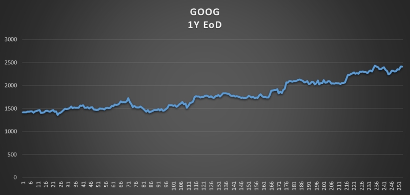
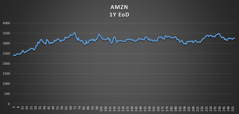
Figure 2 shows the values of the AMZN ticker closures for the last year.
Let us now compare the two stocks with the raw data we have downloaded from the chart analysis as in Figure 3
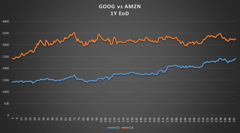
What we notice is that Amazon’s stock remains at higher levels than Google’s over the year.
Now we normalize data and display the normalized values on the same chart, as shown in Figure 4.
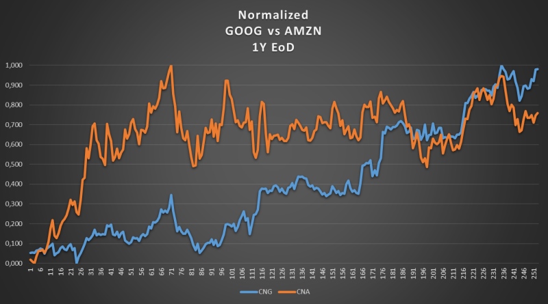
The story told by the new chart is decidedly different. In this mode, it is immediately apparent how Google’s share price is actually growing over time compared to Amazon’s. The representation of normalized data makes the chart effective for trend analysis and therefore for making operational and investment choices.
If you found this article useful and want to know about new articles, I invite you to sign up for my blog’s free newsletter.
Published with licenza CC BY-NC-ND 3.0 IT (Creative Common – Attribuzione – Non commerciale – Non opere derivate 3.0 Italia)