
The invention of the Plateau
The importance of reference in data analysis chart
Published on 04/02/2021 by Donata Petrelli
Reading Time: 4 minutes
It’s no secret now that I love high heel shoes!
While still remaining ourselves, I think the heel gives the female figure a different representation of herself. The fact of being raised off the ground, give a different setting. The consequence is a different posture and outward communication.
So, as a Data Scientist I think that, given the same data, there are different techniques that can be used to conduct analysis and achieve certain goals
We need to choose the right position index when summarizing a statistical distribution to demonstrate or communicate a certain trend. Choosing between the mean, median, or mode can lead to even different results at the end of a statistical analysis. Just as when we represent data we must carefully choose the best type of chart for their representation.
Okay but what does all this have to do with heels? … you will now rightly ask yourself.
There are also several choices for heel height, each of which leads to different results in terms of image, poise and comfort.
A 12 heel is, in general, considered the sexiest. But if we have to wear it for many hours, the discomfort could be such that we feel better with a pair of flats. However, there is a solution: the plateau!
The plateau is the perfect compromise between beauty and comfort of the shoe. It makes our height look greater but, at the same time, the position of the foot is less inclined with respect to the plane, with the feeling of wearing a pair of low shoes!
That’s it, even in data analysis it is possible to find that tool or those techniques that can better transfer a certain information. Communicating the results of a data analysis is in fact a very important task for any analyst or Data Scientist, and finding which methodology to conduct the analysis and its representation allows us to better communicate information to users.
In other words, finding this compromise is analogous to wearing the plateau. 🙂
Does this sound crazy to you? Let’s try an example.
Case study
As a quant, I often have to do with stock charts from which to start with the visual analysis of a trend. Many platforms use for the representation of the data of the assets a diagram to area, with the chromatic indication of the color red and green in order to indicate respective a trend to decrease or to rise regarding a value of reference. In general the data shown in the chart are the close prices of the asset and the reference value is the previous close (of the last session). This is a commonly used interpretation, but we can change it in order to make further analysis, different or more in-depth, compared to the mere comparison with the previous close value.
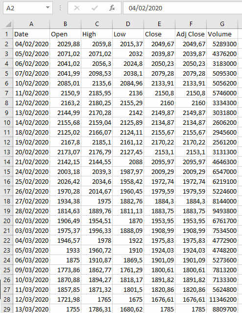
With this new focus, we want to analyze the trend of a stock, for example Amazon. Let’s get the close data of the AMZ ticker for the last year (4/2/2020 to 3/2/2021) and report it on an Excel sheet as shown in Figure 1.
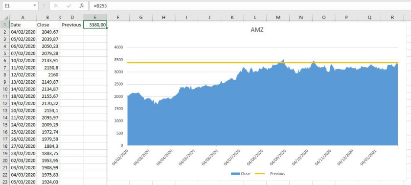
For our purposes, we will only consider the column of closures from here on. Typically, the charting analysis that is done is to evaluate the closing price trend of the stock as a function of the last read close, the previous day’s close, i.e. 3380, as shown in Figure 2.
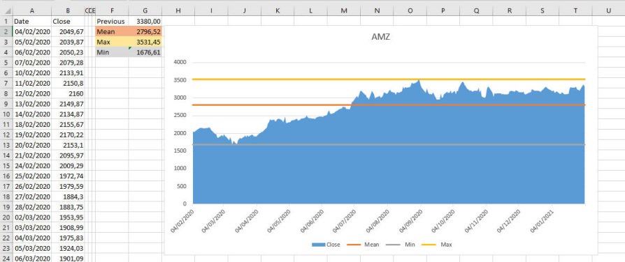
For our analysis we also calculate the average, maximum and minimum value of the close prices of the year and we make the same chart analysis taking as reference point however the average, minimum and maximum values of the year respectively instead of the last value.
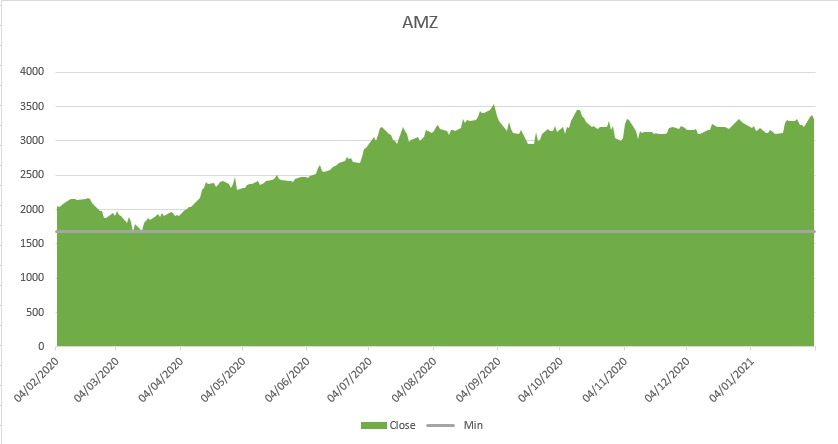
Realizing an area chart of the values of closing of the last year of stock Amazon second the chromatic logic regarding the minimum one obtains a positive trend like in Figure 4
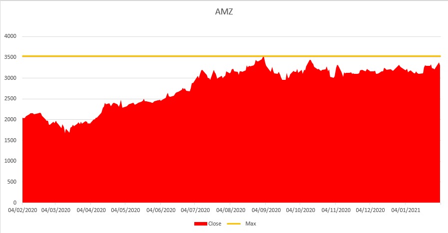
Compared to the maximum a diametrically opposite result as in Figure 5
Conclusion
The idea of this analysis is precisely to change the paradigm and start from a new perspective to arrive at a different information on the asset’s performance.
In this case we take the average value as reference for the chart analysis and obtain the chart in Figure 6.
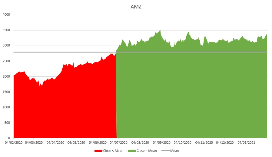
where a situation of initially lower values and then increasing values appears starting from the date 02/07/2020. Therefore, a more balanced analysis compared to the previous ones that provided a totally positive or totally negative picture.
We can say that the average annual value of a series of close prices, rather than the last close value, is our plateau to apply to our analysis!
This is just meant to be a didactic example to show how changing the perspective changes the underlying analysis. Certainly there are many other methodologies to apply.
What would you do?
Title Image credits by Birgith Roosipuu on Unsplash